Paint my House: Exterior Color
- 4.4
- Rating
- 100.00K
- Installs
- Free
- Price

 Analysis by App-foxy
I tried Paint my House: Exterior Color as a quick way to explore paint ideas before committing to an exterior change, and its appeal became clear almost immediately: it turns color comparison into a simple visual exercise rather than a long search through paint cards. The app belongs in the House & Home category, is free to install, and is aimed at anyone who wants to see how a different wall color might change the character of a house.
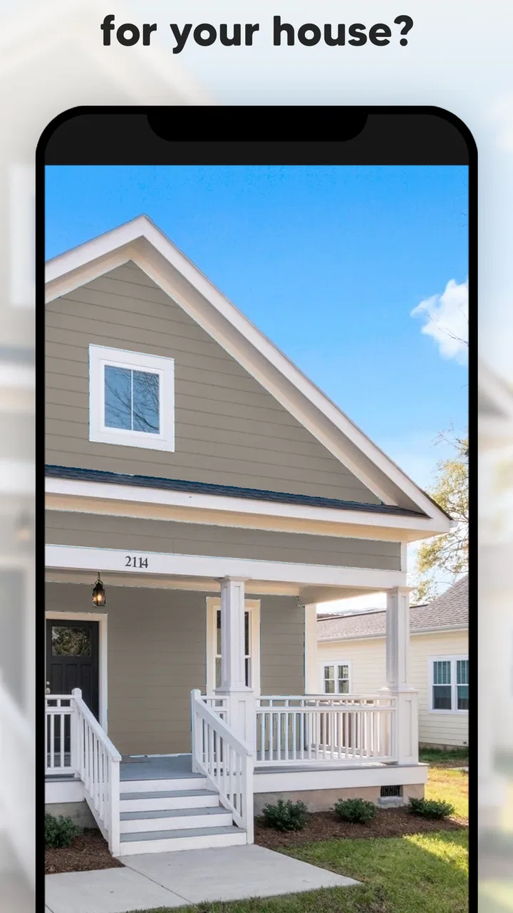
That sounds modest, but it solves a real everyday problem. Exterior colors are difficult to judge from a small swatch because the surrounding roof, trim, windows, paving, plants, and sunlight all affect the result. Here, I could tap through a palette and compare possibilities on a house image. I would not treat the screen as a final promise of how a real wall will look, but it is a useful first filter when several people are trying to agree on a direction.
How the app works when a household is choosing together
The central interaction is deliberately uncomplicated. You select a wall color, view the changed exterior, and move through other options to compare the overall impression. That makes the app particularly suitable for a shared phone or tablet placed on a kitchen table while someone is planning a renovation, refreshing a rental property, or simply wondering whether a darker facade would work.
You May Also Like

 Blood Strike: 2.5 Anniversary
Blood Strike’s Loadouts Turn Every Drop Into a Tactical Gamble
A close look at Blood Strike’s custom loadouts: how fast access to signature weapons reshapes its battle royale rhythm, rewards preparation, and narrows the gap between fights.

 Pandora - Music & Podcasts
Pandora’s Music Is Easy to Start, but Harder to Recover
Pandora’s strength is its low-effort path from a seed to a station. Its weak spot is how much confidence it asks you to place in connection, setup, and quiet recovery.

 8 Ball Pool
 Is Built on Rivalries, Rematches, and Routine
A close look at the rivalries, rematches, shared routines, and unanswered safety questions that turn a quick pool match into a persistent mobile community.

 Samsung Music
’s Quiet Strength Is Playing What You Already Own
Its reach comes less from spectacle than from dependable access to a personal library. That simplicity is both the app’s strongest retention engine and its ceiling.

 AccuWeather: Weather Radar
AccuWeather Review: A Quick, Clear Forecast for Everyday Decisions
For everyday plans, the best forecast is the one you can understand quickly. AccuWeather makes rain timing, radar, and local conditions easy to act on, with a few trade-offs.

 Hill Climb Racing
Why Hill Climb Racing Still Turns Crashes Into One More Run
A tiny car, a bumpy hill and one more upgrade: Hill Climb Racing keeps resurfacing because its simple chaos makes every near-miss feel personal.
More From Our News Desk
View All News


In a shared-use situation, the strongest benefit is speed. One person can suggest a warm neutral, another can ask to see a cooler shade, and both can react to the same visual result instead of describing colors with vague words. I found this more productive than passing around paint brochures, especially when the disagreement was not about the exact shade but about the mood of the whole exterior.
The app is also easy to hand to another person because its main purpose is visible without a long explanation. A child might enjoy experimenting with bold colors, while an adult can use the same activity as an early planning tool. That does not make every result suitable for a real house, but it does make color discussion less abstract.
One useful habit is to compare colors in groups rather than tapping randomly. I first looked at several light options, then several darker ones, and finally returned to the most convincing candidates. This prevents the last color viewed from feeling like the best choice simply because it is fresh in your mind. It also gives a household a clearer shortlist to discuss later.
A practical workflow before opening a paint catalog
I would use this app at the very beginning of a project, before visiting a store or asking for samples. Start by deciding what should stay visually stable: the roof, window frames, doors, stonework, or trim. Then use the color changes to ask a narrower question, such as whether the walls should feel brighter, softer, warmer, or more dramatic.
This approach matters because an exterior color is rarely judged alone. A shade that looks attractive in isolation may compete with a red roof or make dark window frames appear heavier. The app helps with the broad relationship between surfaces, but it cannot replace standing beside the actual building and checking a physical sample in changing light.
My more specific tip is to save the decision in words as well as in your memory. After finding a promising option, describe it to the other person as “the muted light version beside the dark roof,” rather than relying on a vague name or a screenshot that may be hard to identify later. This is especially useful when several household members take turns using the same device.
What setup feels simple, and where boundaries matter
The low-friction design is one of the reasons I can recommend it for casual use. It is not presented as a complicated design suite, and the basic idea can be understood quickly. The developer is Try the Colors s.r.o., and the current version is 3.3.158. It runs on Android devices using 7.0 or later, which covers many older phones and tablets that a household may keep available for shared tasks.
Because this is a shared-device activity, I would establish a small boundary before handing it around: use it for exploring ideas, not for approving a purchase by itself. That distinction protects the household from treating a simulated color as a guaranteed match. It also keeps the conversation focused on preferences instead of turning one tap into a final renovation decision.
There is another practical boundary around spending. The app itself is free, but it includes optional in-app purchases ranging from $0.99 to $29.99 per item. I would make sure the person using a shared device understands that free installation does not necessarily mean every available element is included without charge. On a family tablet, this is worth discussing before children or guests begin exploring.
I also prefer using it when the device is charged and the screen is reasonably bright. That is not a special requirement of the app so much as a sensible way to judge colors. A dim display, strong reflections, or a warm screen setting can make a shade appear different enough to influence the decision. The app is best treated as a comparison surface, not a color-calibration instrument.
Coordinating choices without turning the process into an argument
Color selection often becomes difficult because each person imagines a different finished house. One person pictures a bright, welcoming facade; another imagines maintenance, resale appeal, or how the building will look beside its neighbors. This app helps only when those concerns are separated. I found it more useful to discuss the visual effect first and practical concerns second.
A good shared workflow is to let each person choose a small number of favorites independently, then compare the overlap. If nobody selects the same shade, that is still informative: perhaps the group has not agreed on whether the exterior should be subtle or expressive. The app makes that difference visible quickly, which is more constructive than debating paint names without seeing them.
For a couple planning a weekend project, I would use the app to narrow the field to two or three directions, then take those choices to physical samples. For a landlord or property manager, it can help communicate a general intention to someone who is not standing at the property. For a homeowner working with a contractor, it may be useful during the early conversation, but I would still confirm the final specification through the contractor’s normal sample process.
One non-obvious advantage is that the app can expose a household’s tolerance for contrast. Instead of asking, “Do you like blue?” I could ask, “Do you prefer the wall to stand apart from the trim, or blend into it?” That produces a more useful decision because exterior color is about relationships, not just personal favorite colors.
Age, trust, and the limits of a shared screen
The content rating is Everyone, and the simple color-changing interaction makes the app approachable across ages. I can imagine younger users enjoying it as a creative activity, while older users may appreciate that the controls do not require design experience. Still, an Everyone rating should not be confused with a guarantee that every result is appropriate for a real building or every purchase decision.
With children, I would frame the app as a supervised design exercise. Let them create an imaginative exterior, then explain that real paint choices also depend on weather, materials, local rules, and the existing structure. This keeps the activity fun without teaching them that a screen preview is the same as a professional recommendation.
Trust also matters between adults. If one person uses the shared device and later says, “This was the color we chose,” the others may not know whether it was a genuine group decision or simply the last option viewed. I recommend taking a note or screenshot after the group agrees, including the surrounding context of the house image. The app is good at showing possibilities, but it does not replace a household’s own record of what was approved.
For privacy-conscious users, the sensible approach is to avoid treating the app as a place for confidential project information. I would not use a shared device to store sensitive renovation documents or personal details merely because the color exploration is convenient. The app’s value is visual and immediate; there is no reason to make the workflow more complicated than that.
Where it is stronger than ordinary alternatives
The usual alternative is to collect paint cards, hold them against the wall, and imagine the result. Physical cards are valuable because they show real material and texture, but they are slow for broad exploration. This app is faster when the question is, “Which general color family suits this exterior?” I could move through many ideas without carrying a stack of samples from room to room.
Another alternative is a general image editor. That may offer more control, especially for someone who wants to work from a photograph of their own house, but it can also demand more manual effort. For a quick first pass, a focused color-preview tool is less intimidating. I would choose a full photo editor only when accurate masking, custom surfaces, or detailed before-and-after documentation becomes important.
Professional visualization software remains the better choice for a serious renovation presentation. It can be more precise and may support materials, lighting, trim, landscaping, or multiple viewpoints. Paint my House: Exterior Color is not a substitute for that level of planning. Its strength is the early conversation, where speed and clarity matter more than technical precision.
The trade-off is therefore straightforward: this app gives me quick visual direction, while physical samples and professional tools provide better confirmation. I would not ask it to perform the job of either one. Used in the right order, however, it can prevent wasted time by eliminating colors that clearly do not fit the house before more expensive steps begin.
Performance expectations and everyday friction
The simplicity is helpful, but it also defines the limits of the experience. A one-tap color change is convenient, yet the result depends on how convincingly the wall area is represented. Edges around windows, rooflines, doors, and decorative features can affect how believable a preview feels. I paid more attention to the overall balance than to tiny boundary details, because that is where the app is most useful.
Screen color is another source of uncertainty. The same shade can look different on two devices, and daylight can change the way a display appears. If two household members use different phones, they should compare the same option on the device that will guide the final discussion, rather than assuming every screen is identical.
The free entry point makes experimentation accessible, but optional purchases may affect how far someone wants to explore. I would begin with the available experience and decide whether the extra choices genuinely help the project before spending. For a one-evening color discussion, the free route may be enough; for frequent design experimentation, a user may judge the additional items differently.
There is also a psychological limitation: attractive colors can make a house look more finished than it really is. The app cannot show whether the current siding needs repair, whether the surface accepts paint properly, or how much preparation will be required. If the walls are damaged, damp, textured, or made from a material with special restrictions, practical inspection should come before visual enthusiasm.
Who should use it, and who should choose something else
I think it is a strong fit for homeowners at the brainstorming stage, couples trying to reach a shared decision, renters imagining future possibilities, and anyone who struggles to translate a small color swatch into a full exterior impression. It is also a friendly option for a shared household device because the main activity is easy to demonstrate and discuss.
I would be more cautious recommending it to someone who needs a precise rendering of their own property. If the exact arrangement of windows, roof angles, trim, or materials is central to the decision, a tool that works directly from a carefully prepared photo may be better. Likewise, a professional designer who needs documented specifications and repeatable presentation controls will probably outgrow this app quickly.
People who dislike visual experimentation may also find limited value here. The app does not make the final choice for you; it gives you a faster way to compare your own ideas. If you already have a confirmed color and only need a purchase quantity or technical paint advice, a retailer or contractor will be more useful.
For me, the best use case is a short, focused session: explore broad directions, identify a few candidates, discuss how they relate to the roof and trim, and then move to real samples. That workflow respects both the app’s convenience and its limitations.
My household verdict
Paint my House: Exterior Color earns its place as a practical first-step tool rather than a complete renovation planner. Its 4.5 average from around 3.3 thousand ratings and more than 100 thousand installs suggest that the straightforward concept has found an audience, and I can understand why. It removes much of the hesitation from the first stage of exterior color planning.
The app is free to download, rated Everyone, and was released on January 27, 2025. Those details make it easy to try without treating the installation as a major commitment. I especially like it for households where several people need to see the same idea quickly, provided everyone understands that the preview supports discussion rather than replacing samples or expert checks.
My final recommendation is to use it with a simple three-step rule: explore on the screen, agree on a shortlist together, and verify the finalists in real conditions. That keeps the experience enjoyable while avoiding the most common mistake—assuming a digital color preview can account for every surface, light condition, and construction detail.
If you want a fast way to turn “maybe we should repaint” into a concrete conversation, I would recommend giving it a try. If you need a measured rendering, material advice, or a final specification, move on to a more specialized option after this first round. In that role, this House & Home app is focused, approachable, and genuinely useful without pretending to be more precise than it is.
FAQs for Paint my House: Exterior Color
01What is Paint my House: Exterior Color and how does it work?
Paint my House: Exterior Color is an app designed to help users visualize different color schemes on their home exteriors before making a decision. By uploading a photo of your house, the app allows you to apply various paint colors to see how they’ll look in real life. This feature helps users make informed choices about their exterior color options.
02Is Paint my House: Exterior Color free to use?
The app offers a free version with basic features, allowing users to experiment with a limited palette of colors. However, for access to premium color options, textures, and advanced tools, there is a subscription model. Pricing details and what each tier includes are available in the app’s settings or on the download page.
03Can Paint my House: Exterior Color accurately match real paint colors?
While the app strives to provide accurate color representations, users should note that digital colors may vary slightly from actual paint due to screen settings and lighting conditions. It is recommended to use the app as a guide and then consult with a paint professional or obtain physical samples for the best match.
04Is Paint my House: Exterior Color available for both Android and iOS devices?
Yes, Paint my House: Exterior Color is available for download on both Android and iOS platforms. Users can access the app via Google Play Store for Android devices and the Apple App Store for iOS devices. Ensure your device meets the minimum system requirements for optimal performance.
05Does Paint my House: Exterior Color offer customer support?
Yes, the app provides customer support for users who need assistance. Support options include an in-app help section, a comprehensive FAQ guide, and direct contact with the support team via email. Users can expect timely responses to inquiries and troubleshooting issues during business hours.
Pros
- Easy to use interface for quick color changes.
- Wide range of colors and textures available.
- Allows photo uploads for realistic previews.
- Customizable paint options for detailed planning.
- Real-time updates on color changes.
Cons
- Limited free features; many require purchase.
- Occasional lag when loading high-res images.
- No offline mode; requires constant internet.
- Few options for non-standard materials.
- Ads can be intrusive without premium upgrade.

Paint my House: Exterior Color
Gallery